

Trends
Trends
The trends dashboard shows how your visibility metrics evolve across runs. Use it to measure the impact of your optimization efforts over time and identify which AI providers are improving or declining.
Metrics tracked
Three core metrics are tracked across every run:
- Entity mention rate -- percentage of AI responses that mention your company by name.
- Website citation rate -- percentage of AI responses that cite your website.
- First mention rate -- percentage of AI responses where your company appears first among competitors (available in overall view only).
Progress summary
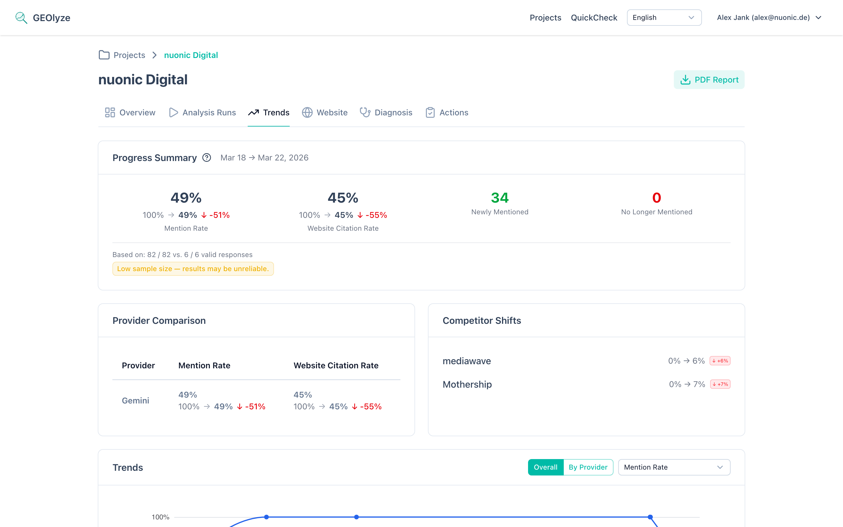
At the top of the trends page, a summary card compares your latest run with the previous run:
- Current rates for entity mention rate and website citation rate, each with a delta indicator showing the change (improved, declined, or unchanged).
- Prompts gained -- number of prompts where your company is now mentioned but was not in the previous run.
- Prompts lost -- number of prompts where your company is no longer mentioned.
- Period label -- the date range of the comparison.
Sample size transparency
Below the summary, the number of valid responses out of total responses is shown for both the latest and base run. If the sample size is low or there is a significant mismatch between runs, a warning badge is displayed to indicate that results should be interpreted with caution.
Provider comparison
A table breaking down performance by AI provider (Claude, OpenAI, Gemini, Perplexity). For each provider, you see:
- Current entity mention rate with delta from the previous run.
- Current website citation rate with delta from the previous run.
- Change direction indicator (improved, declined, or unchanged).
This helps you identify which AI systems are responding best to your optimization efforts.
Competitor shifts
A section tracking how competitor visibility changes relative to yours. For each competitor:
- Previous and current mention rate.
- Direction and magnitude of change.
This is shown with inverted color coding: a competitor's increase is displayed as a decline (red) from your perspective, and vice versa, helping you quickly spot competitive threats or gains.
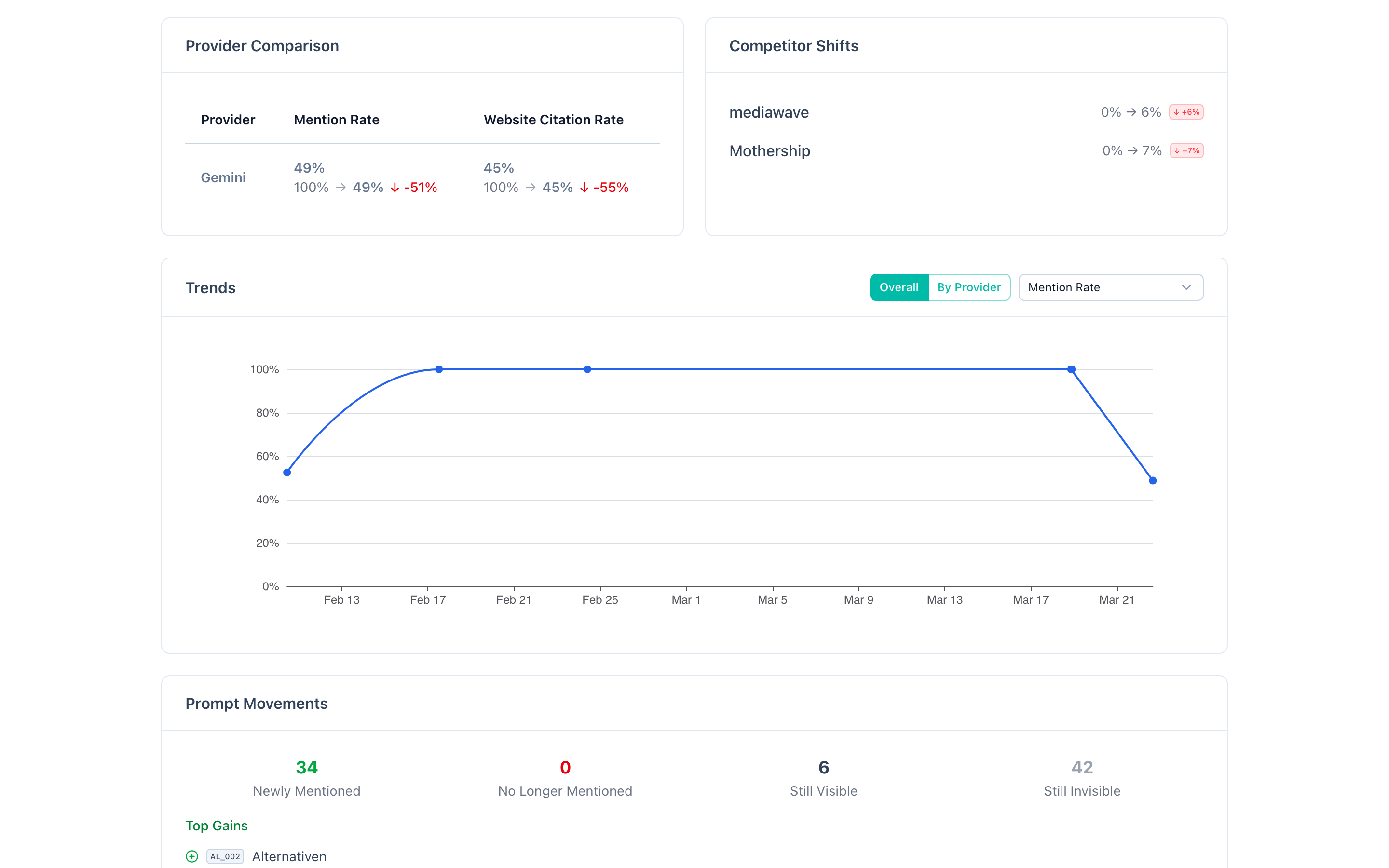
Trend chart

An interactive time-series chart visualizing your selected metric over all completed runs. Features include:
- View modes: Toggle between Overall (aggregated across all providers) and By Provider (separate lines per AI provider).
- Metric selector: Switch between entity mention rate, website citation rate, and first mention rate (first mention rate is only available in overall mode).
- Action markers: If you have logged optimization actions on the actions page, they appear as markers on the timeline, helping you correlate changes with specific actions you took.
- Data points are plotted at the completion date of each run.
Prompt movements
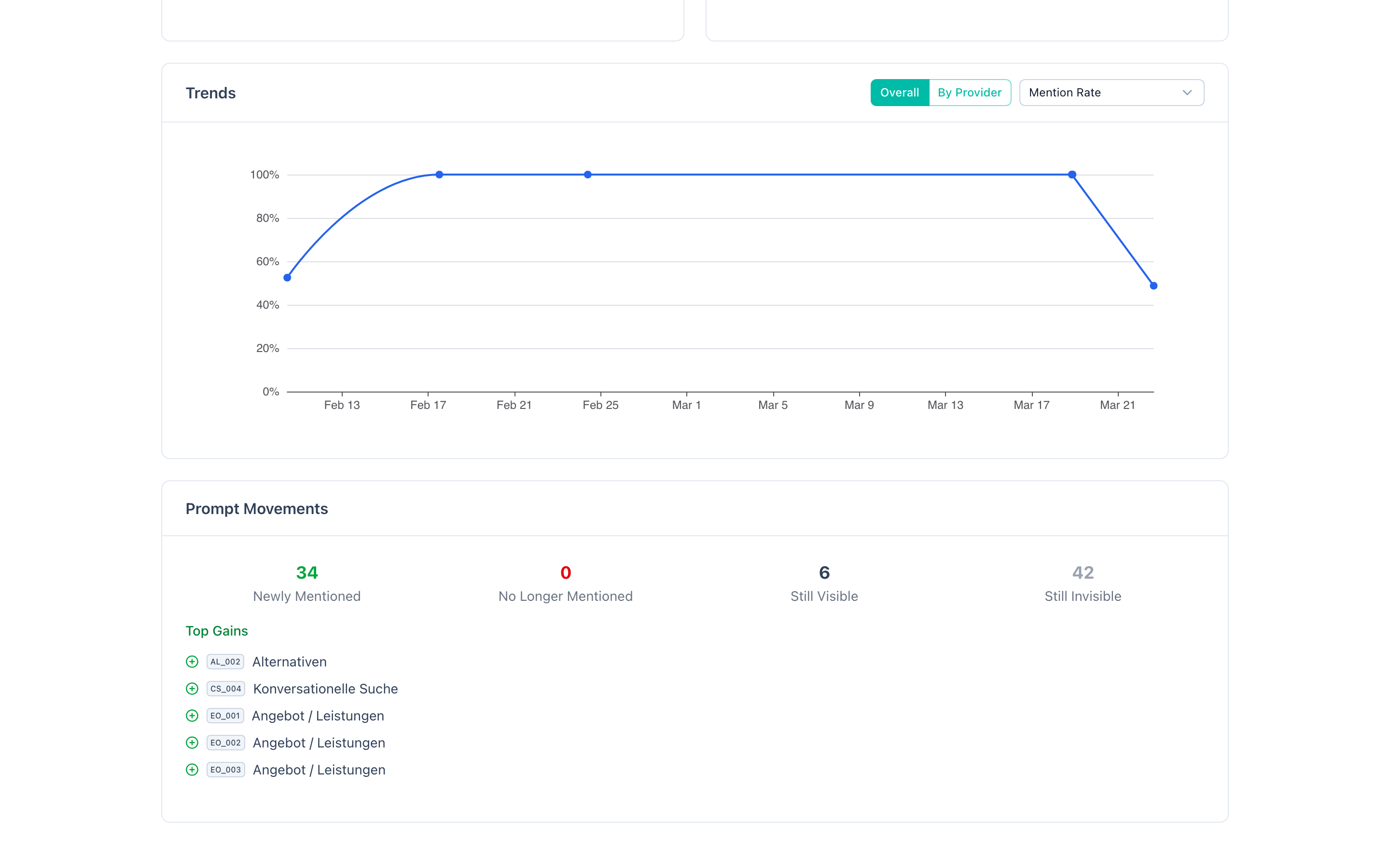
A detailed breakdown showing exactly which prompts changed status between runs:
- Gained -- prompts where you are now mentioned (with count).
- Lost -- prompts where you are no longer mentioned (with count).
- Stable visible -- prompts where you are consistently mentioned.
- Stable invisible -- prompts where you remain unmentioned.
The top gains and top losses sections list the specific prompts (by prompt reference and label) that changed, so you can understand exactly what shifted.
Exporting trends
Click Download PDF to generate a comprehensive trends report. See Reports for details on what the trends report includes.